Logo and identity design for Exotic Season, a Salvadoran pantry in Houston
Exotic Season — Marca
Branding
Three complete logo routes for a Salvadoran store in Houston, and the decision that turned the winner into a brand that fits in a favicon.
- Scope of work
- Branding
- Client
- Exotic Season
- Year
- 2024
How do you design the logo for a Salvadoran grocery store?
Exotic Season imports Salvadoran produce and pantry goods to Houston. Before the store existed there was no brand, no palette, and no answer to that question.
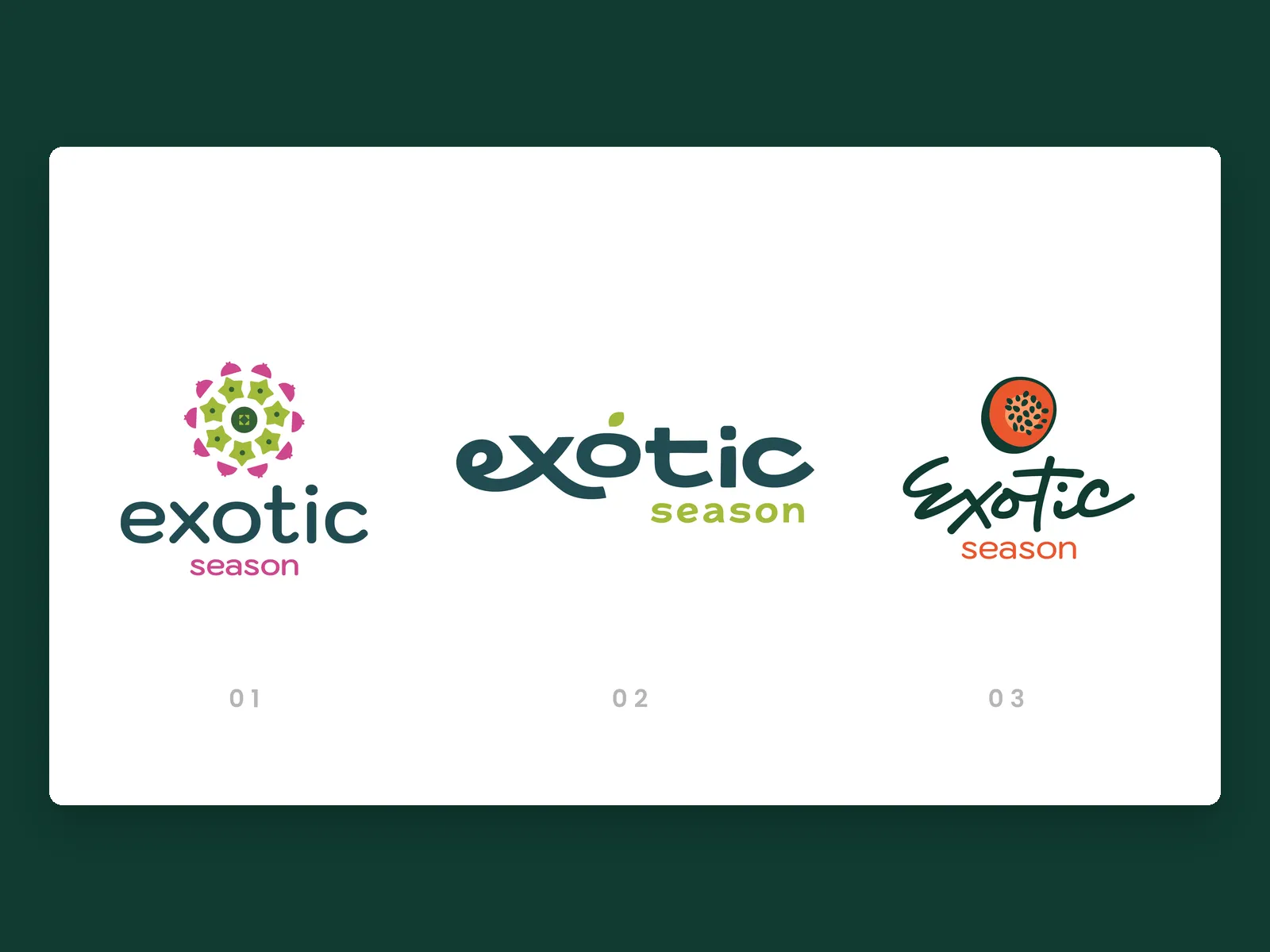
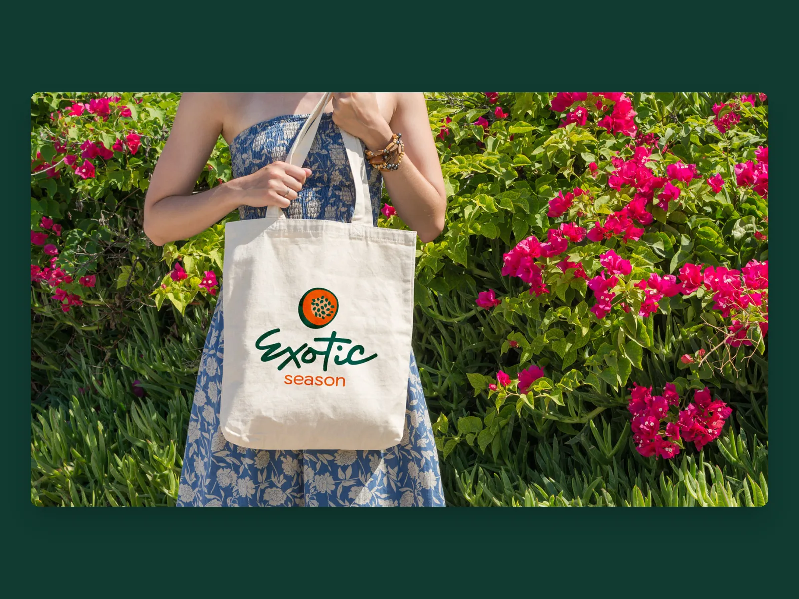
So we did not send one logo. We built three complete routes — typography, symbol, color, and a bag to test each one — and let the client decide with all three in front of them.
guava · soursop · rambutan · mamey · nance · jocote · pacaya · loroco
Three finished proposals, not three sketches
01 · Burst of flavor A mandala built from fruit slices, in magenta and lime, over a soft lowercase. It reads as celebration and abundance: the whole basket at once. Beautiful as a pattern. But a mandala takes reduction badly: at the size of a browser tab it turns into a dot.
02 · Organic freshness A rounded geometric typeface with a leaf growing out of the o. Clean, modern, very easy to reproduce anywhere. It also looked like every other healthy-food brand, and this store is not a health-food store. It is the pantry people left behind.
03 · Free and fresh Handwritten lettering with a cut guava on top, in deep green and orange. It was the only one with a hand in it. This is the route that moved forward, although the symbol did not survive as drawn.
What changed between the route that won and the logo that shipped
The lettering stayed. The color did not. The calligraphy survived because it is the one thing a competitor cannot pull from a font menu. The orange went: against photography of real fruit it argued with the product instead of framing it. Deep green won because everything the store sells can be photographed on top of it without clashing.
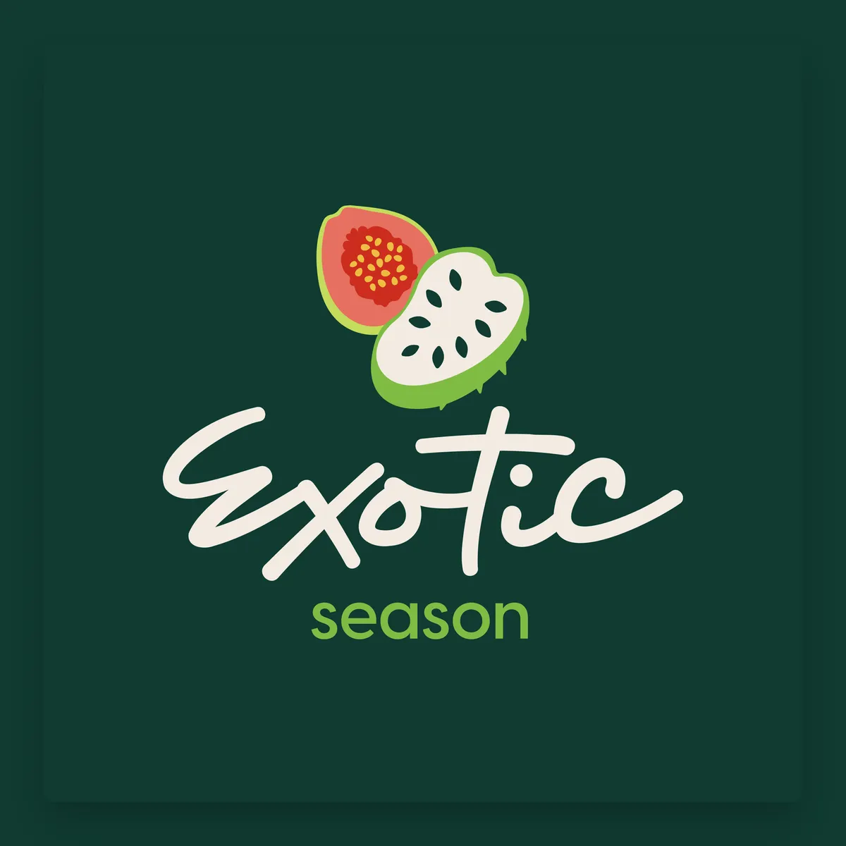
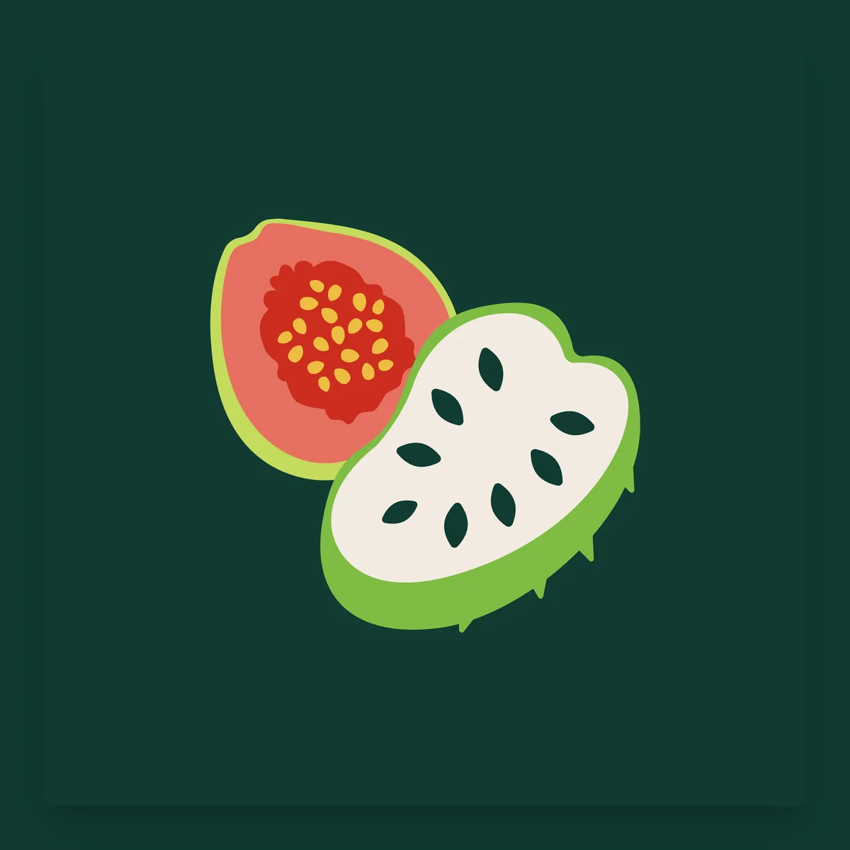
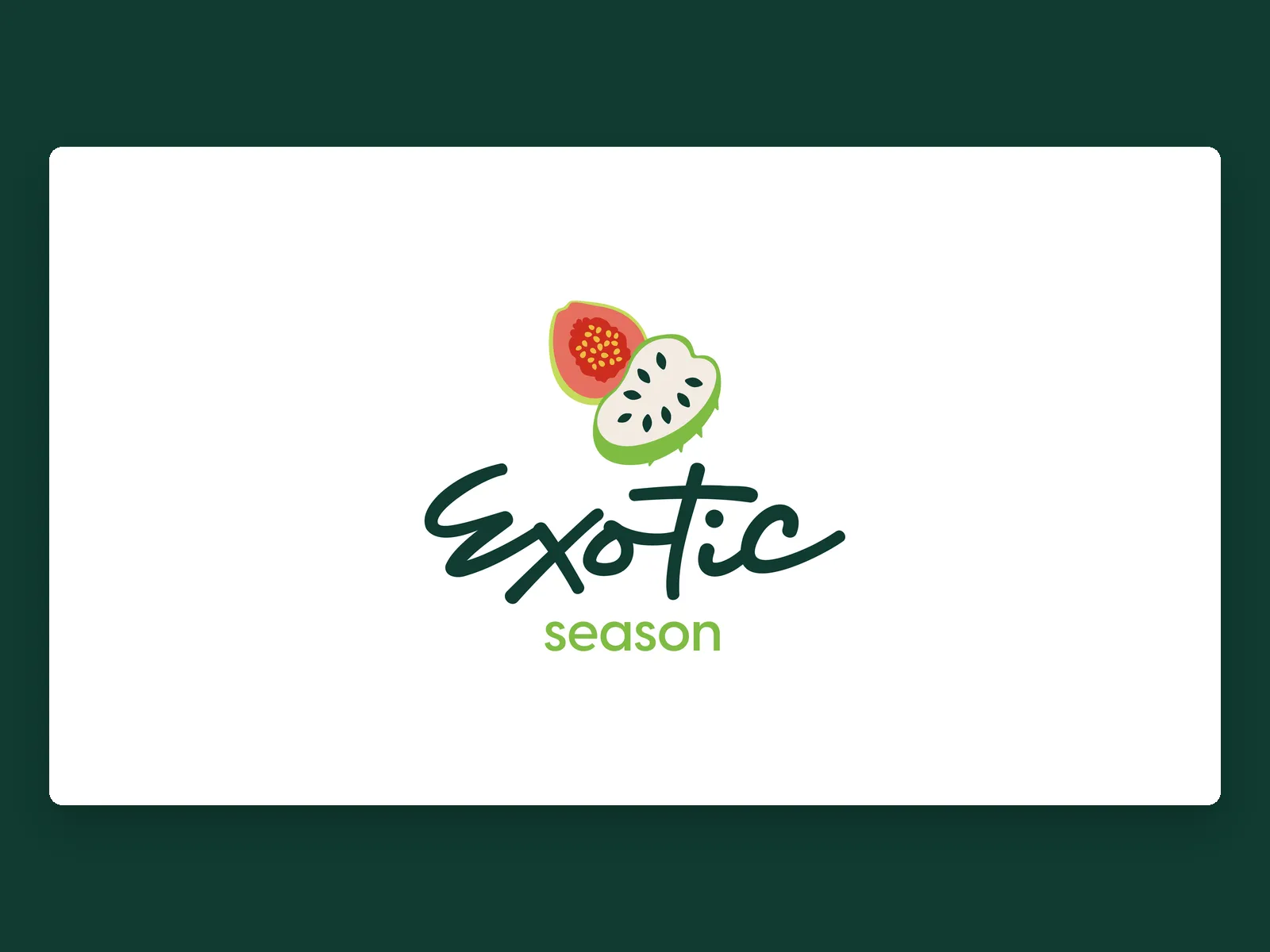
One fruit became two Route 03 put a single guava in a circle. The final brand opens two fruits — guava and soursop — and overlaps them. Two say variety without having to draw forty. The cut says fresh, and it is the view a supermarket shelf never gives you.
It had to hold up as a favicon Drawn flat, no gradients, four colors. That is what lets it hold at 32 pixels in a browser tab and also fill a tote bag, from the same file.
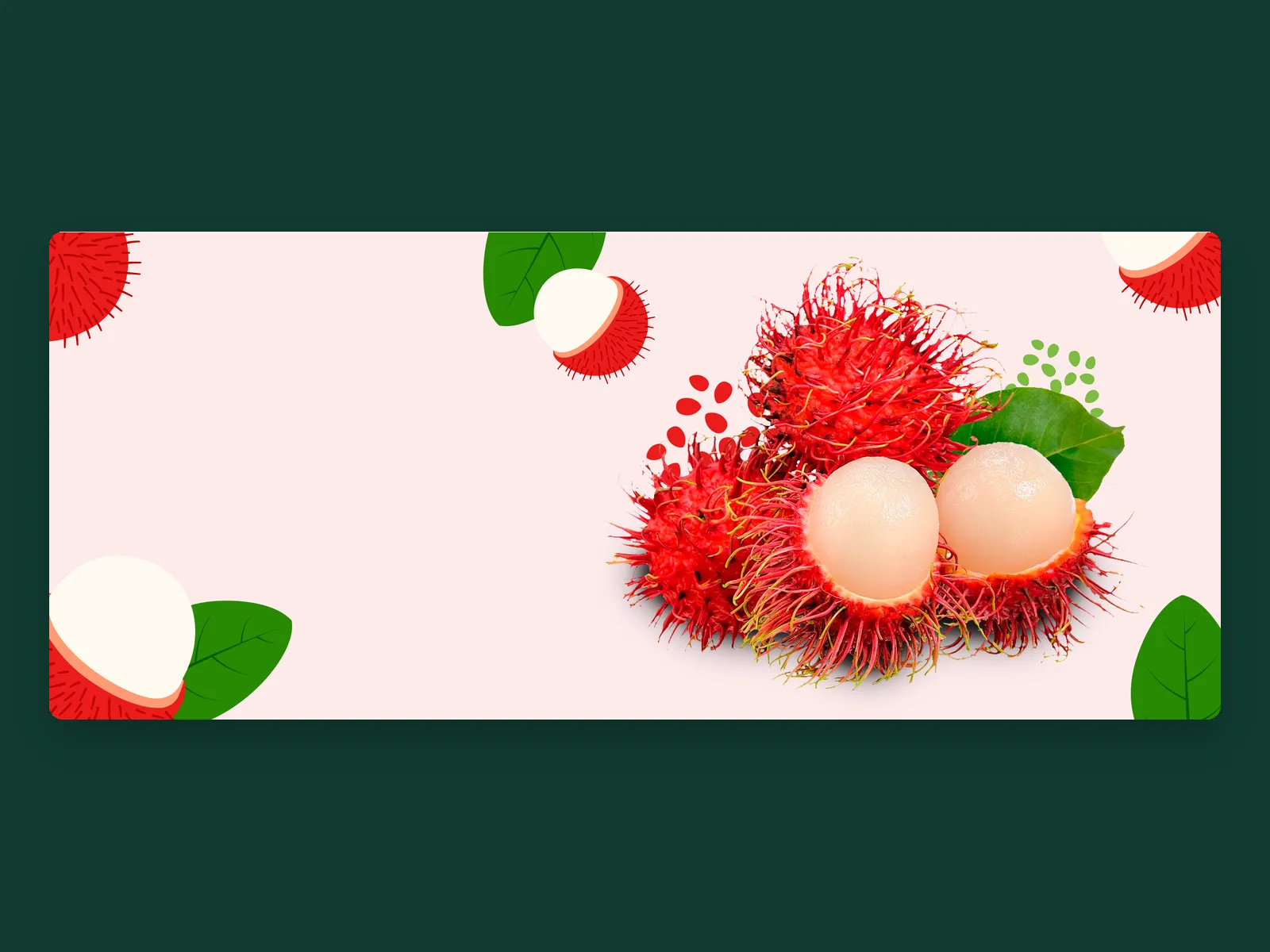
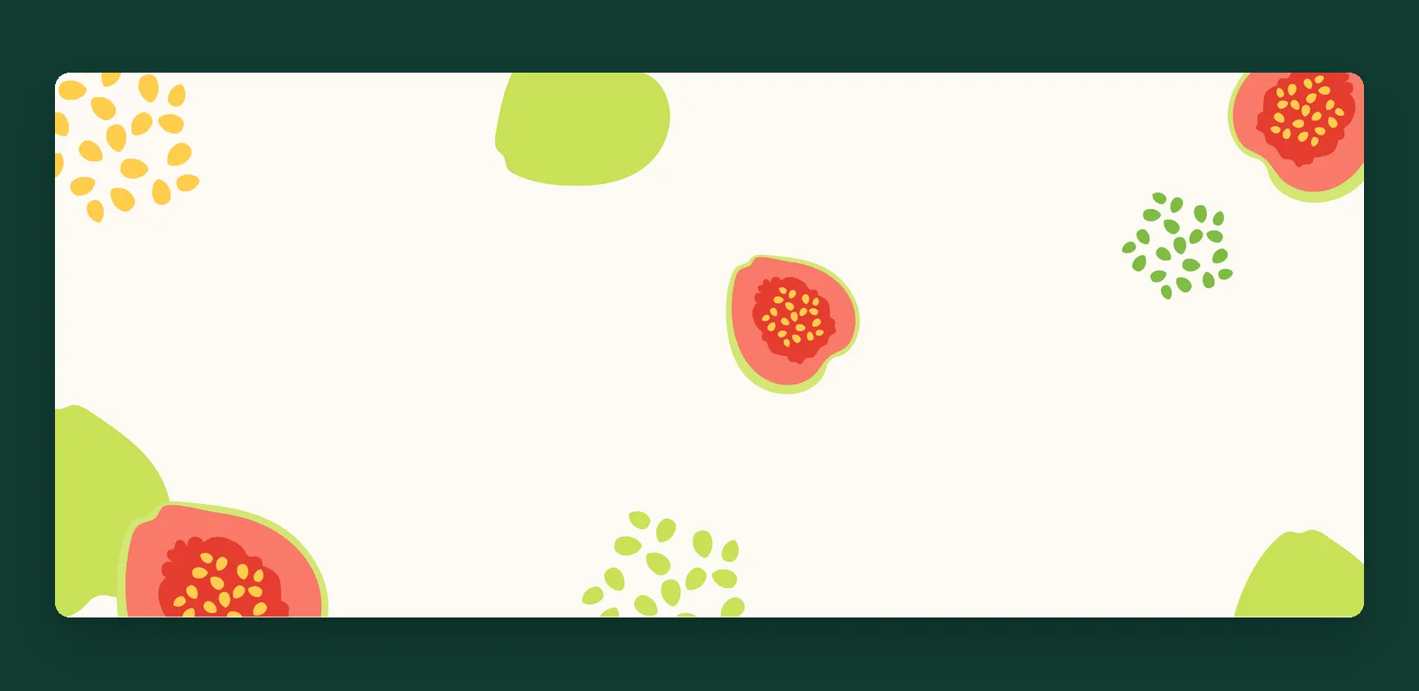
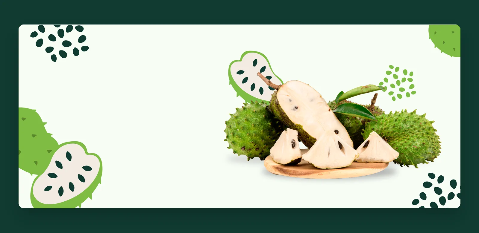
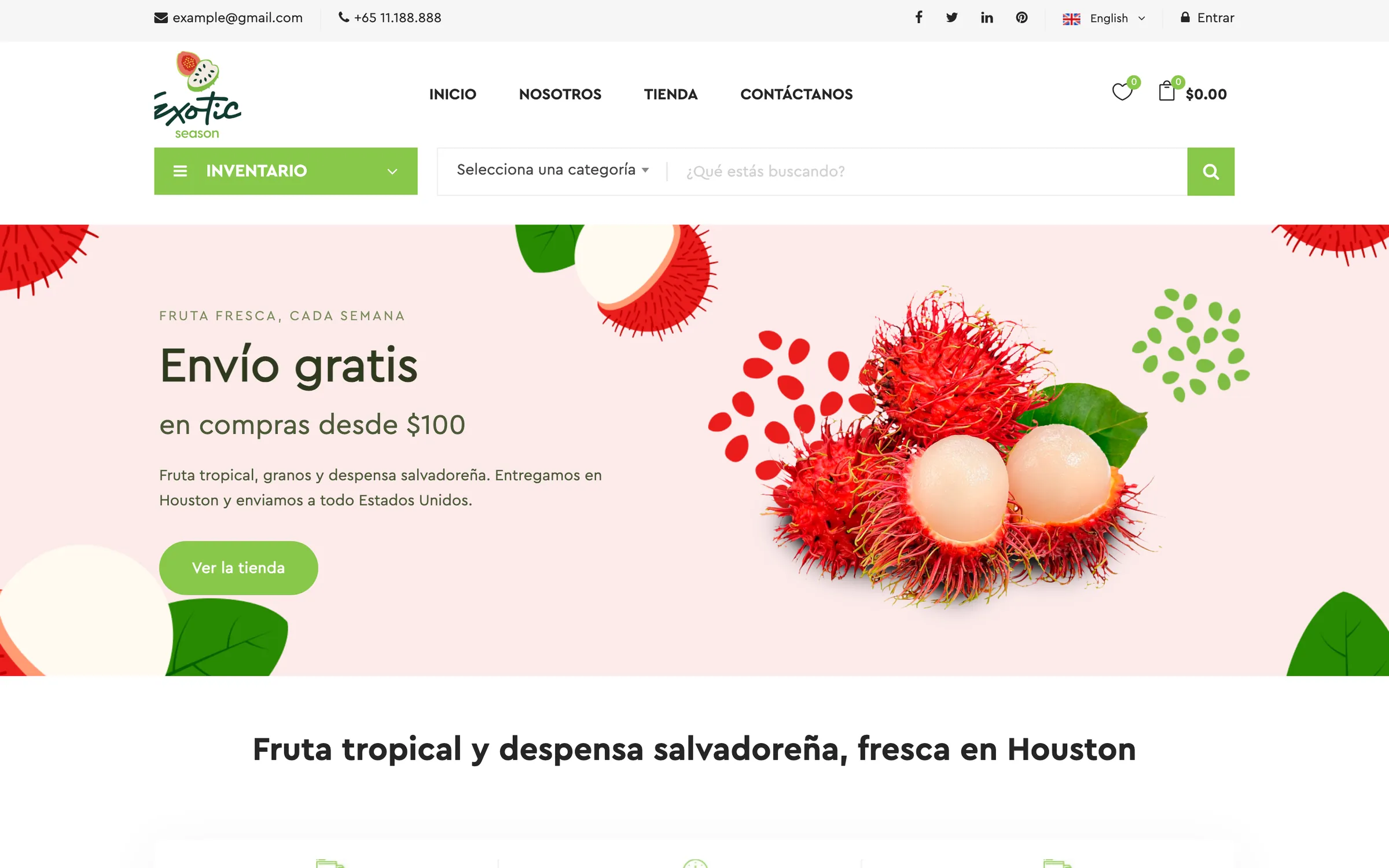
The logo ended up building the store The cutout of the two fruits became a system: each category has its own tinted banner with its own fruit, drawn in the same flat language. The identity did not stay in the logo: it is what the store is made of.
logo · palette · banner system · application
What we did
How do you choose between three logo routes for a pantry brand?
Exotic Season is not a fruit brand. It is a Salvadoran pantry, and the brand had to say so at a glance.
Live project