Brand identity and merch design for Ritual Púrpura, a coffee brand in El Salvador
Ritual Púrpura
Branding
Logo, illustration and merch for a coffee brand: a torogoz over the map of El Salvador, purple with orange, and lines made to be worn.
- Scope of work
- Branding / Illustration / Merch design
- Client
- Ritual Púrpura
- Market
- El Salvador
- Year
- 2026
How do you design the identity of a coffee brand in El Salvador?
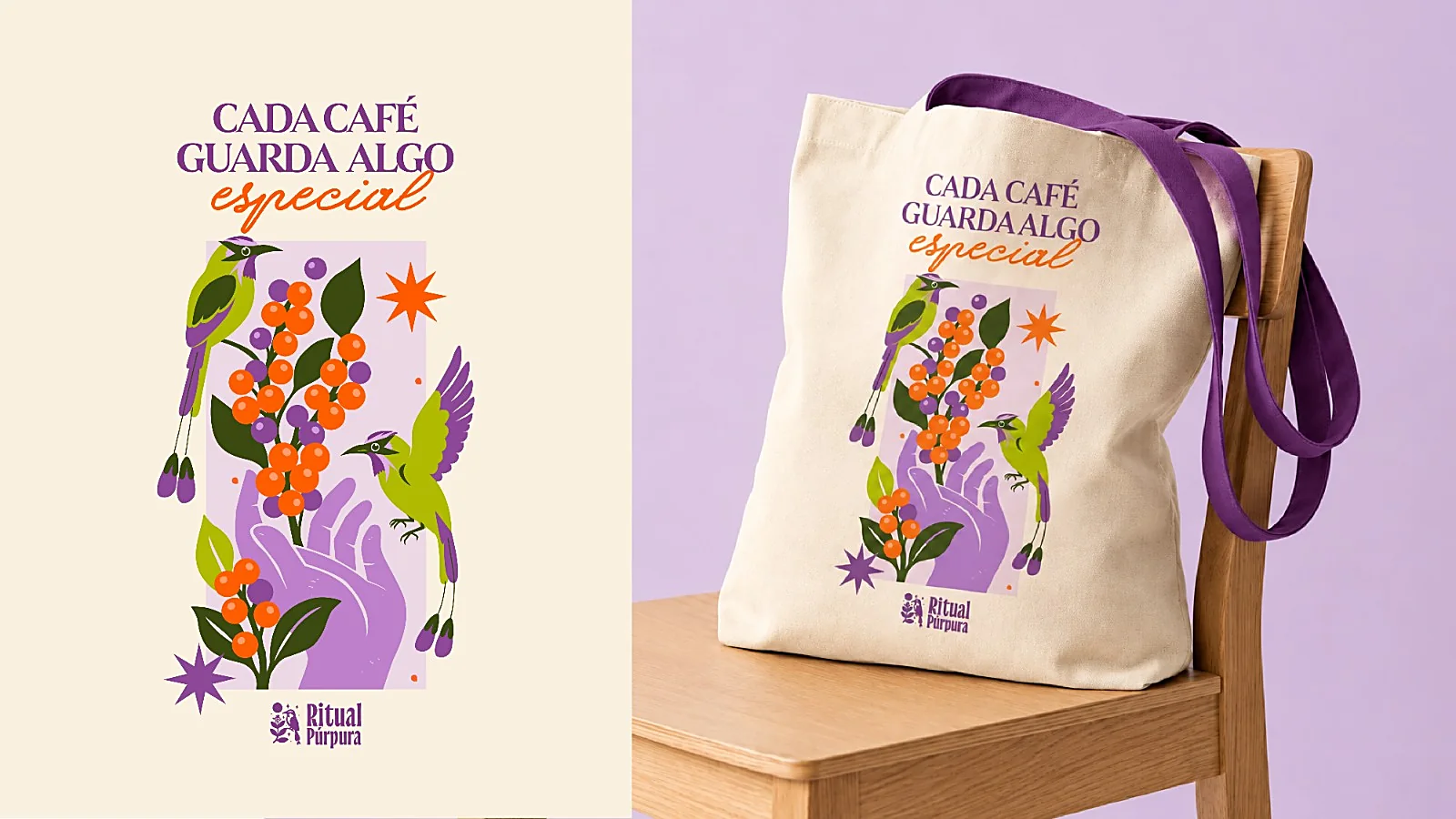
The brand does not talk about coffee as a product but as a ritual. Its idea fits in one line: «Cada café guarda algo especial», every coffee keeps something special. The identity had to say that before anyone read the label.
Color does the first part of the job. Purple and lilac, where the category tends to stay in browns and creams, with orange and green as accents.
The identity
What does the Ritual Púrpura logo tell?
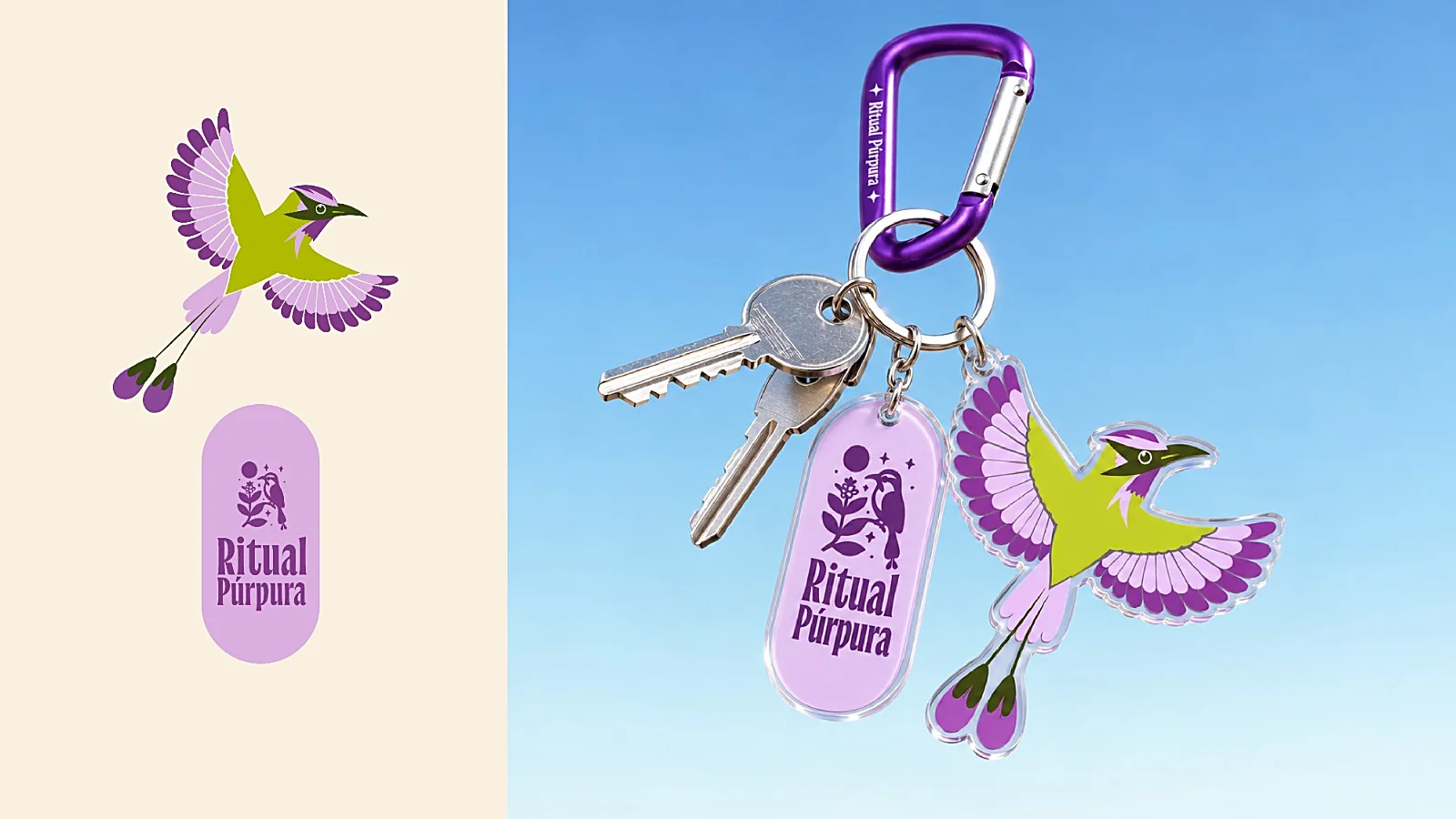
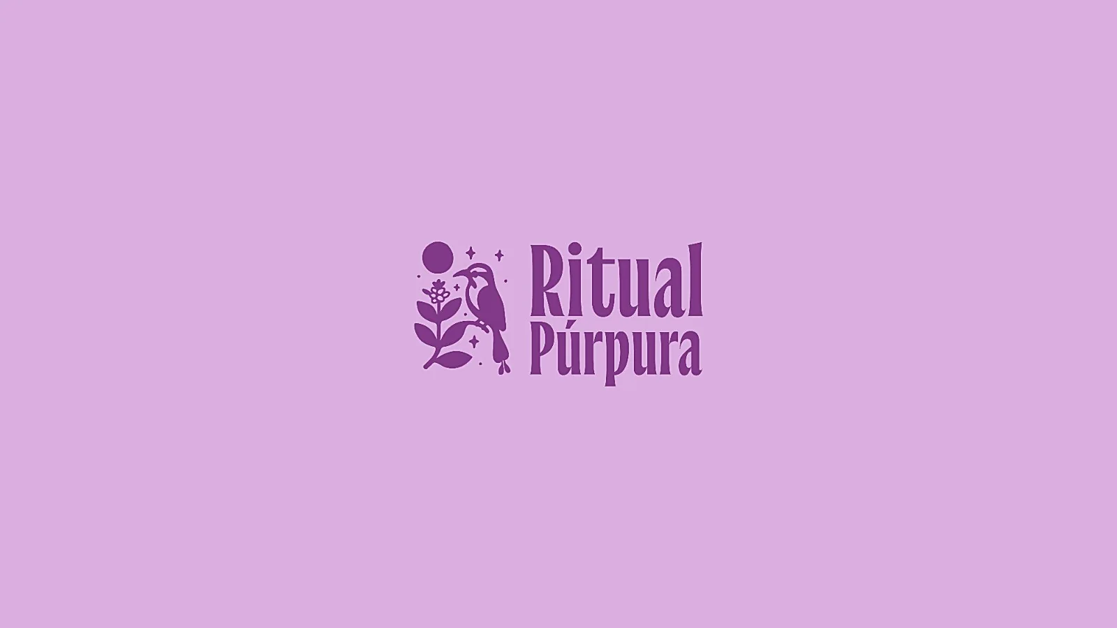
The symbol brings together a perched bird, a coffee branch, the sun and a few stars. The wordmark is set in a tall, high-contrast letter, and everything works in one ink: purple on lilac, white on orange, or on a tag over the pattern.
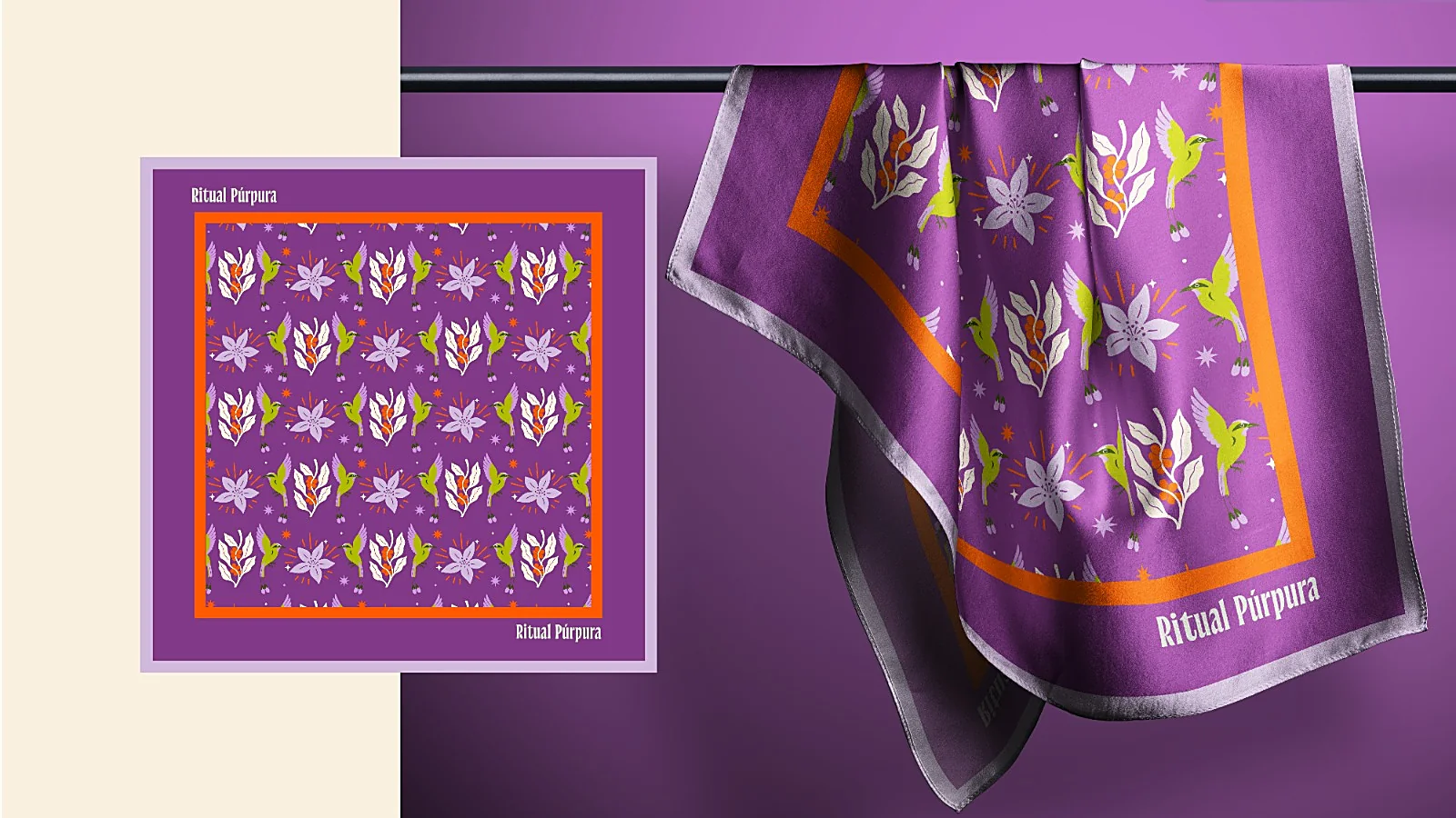
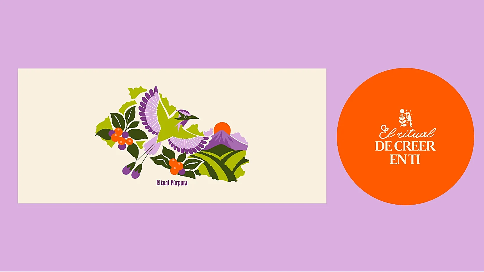
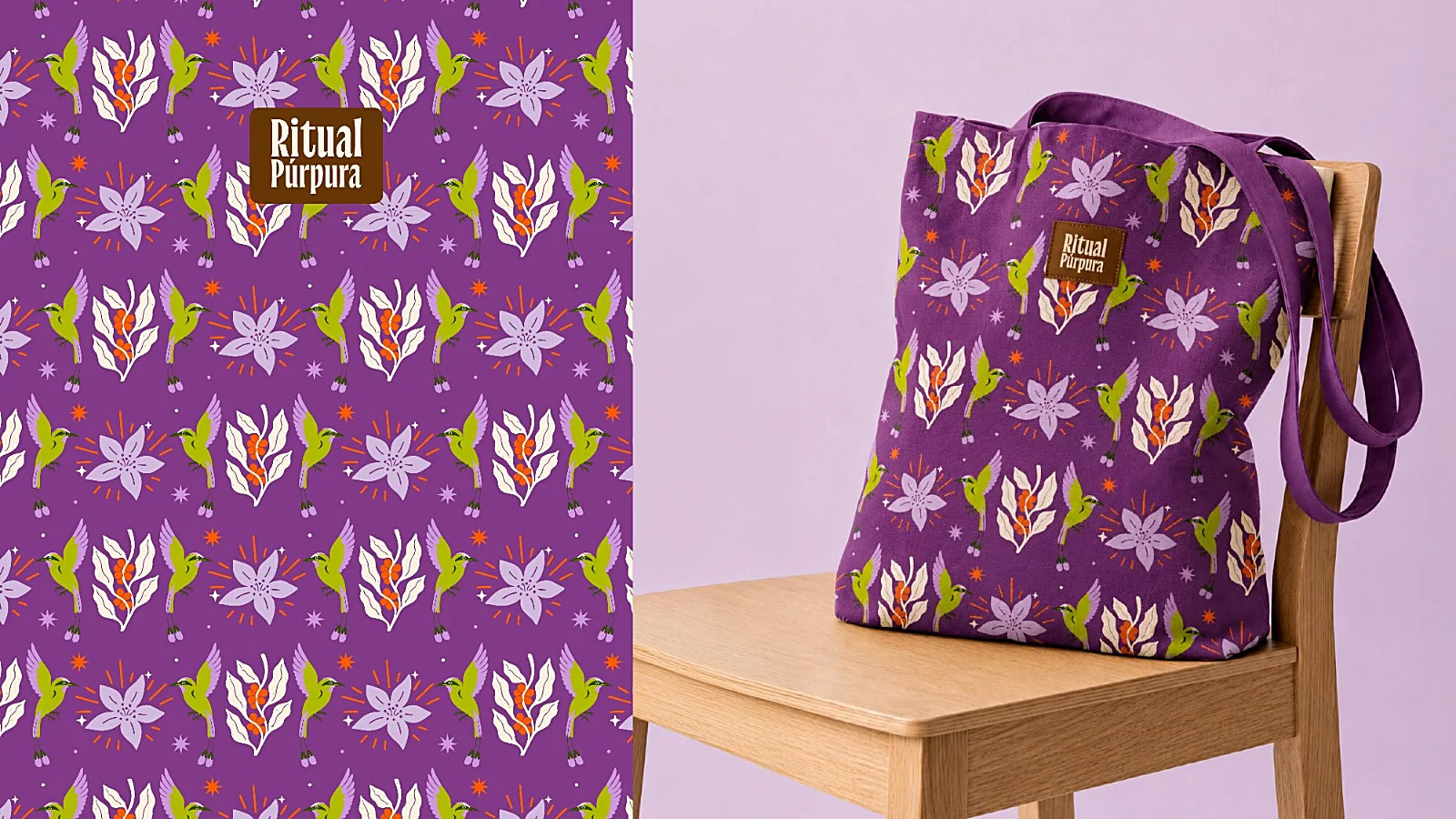
The main illustration goes bigger. The torogoz with open wings over the map of El Salvador, among coffee branches, the volcano, the sun and the rows of the coffee field. From there comes the pattern of flowers and birds on the tote and the scarf.
The merch
What merch pieces were designed for the brand?
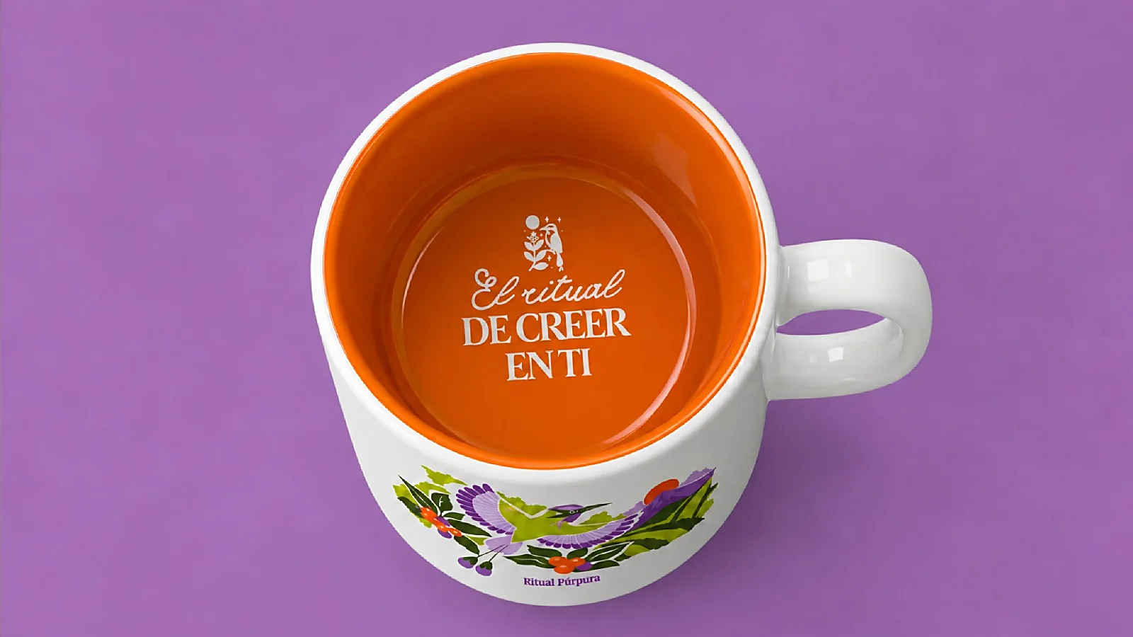
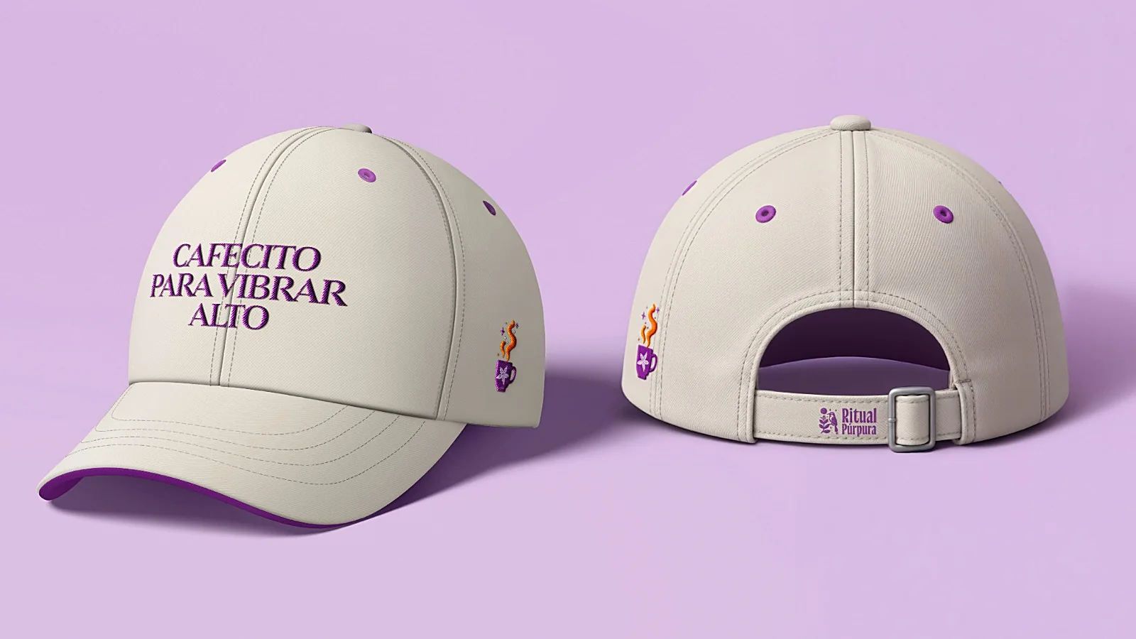
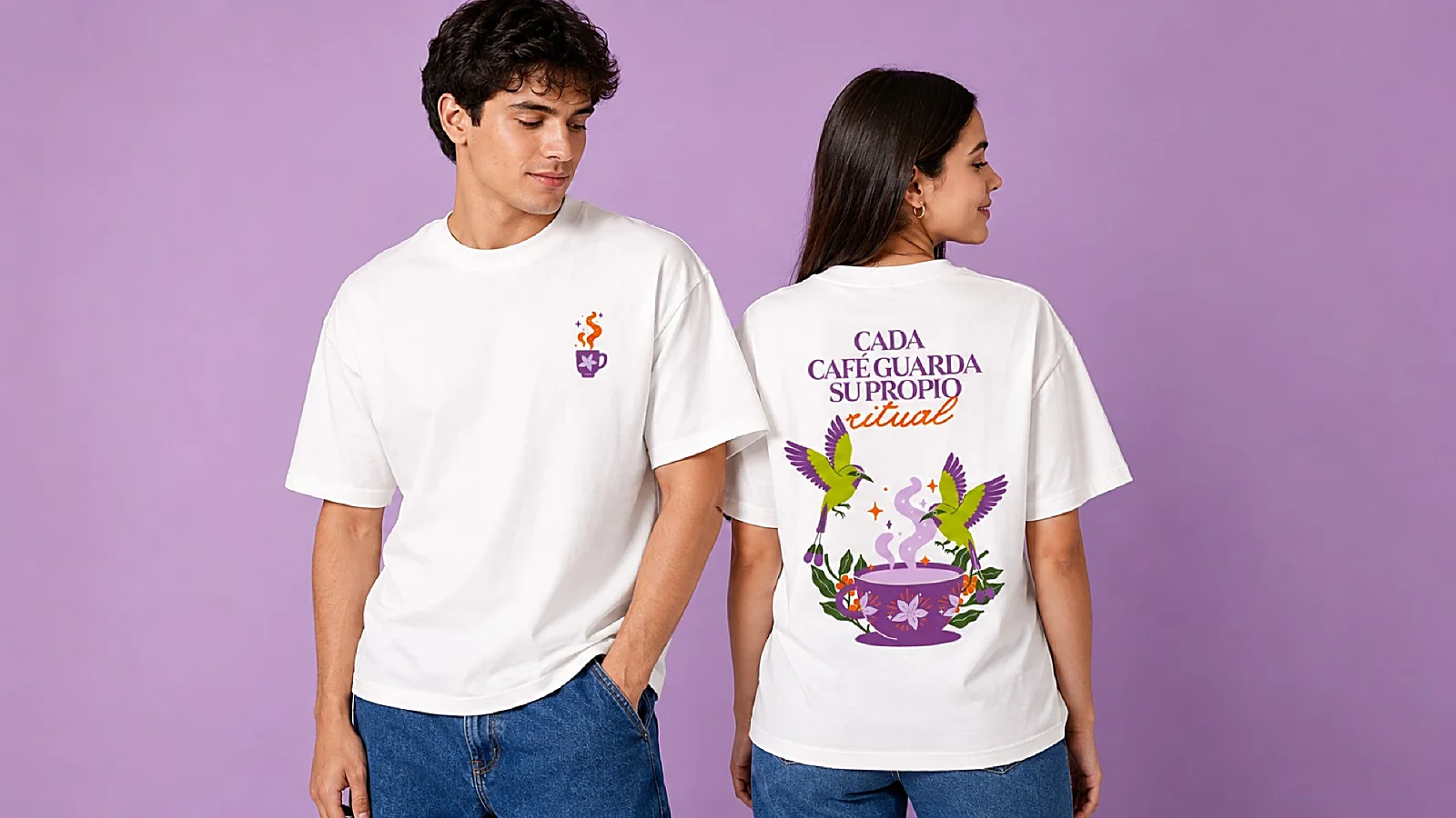
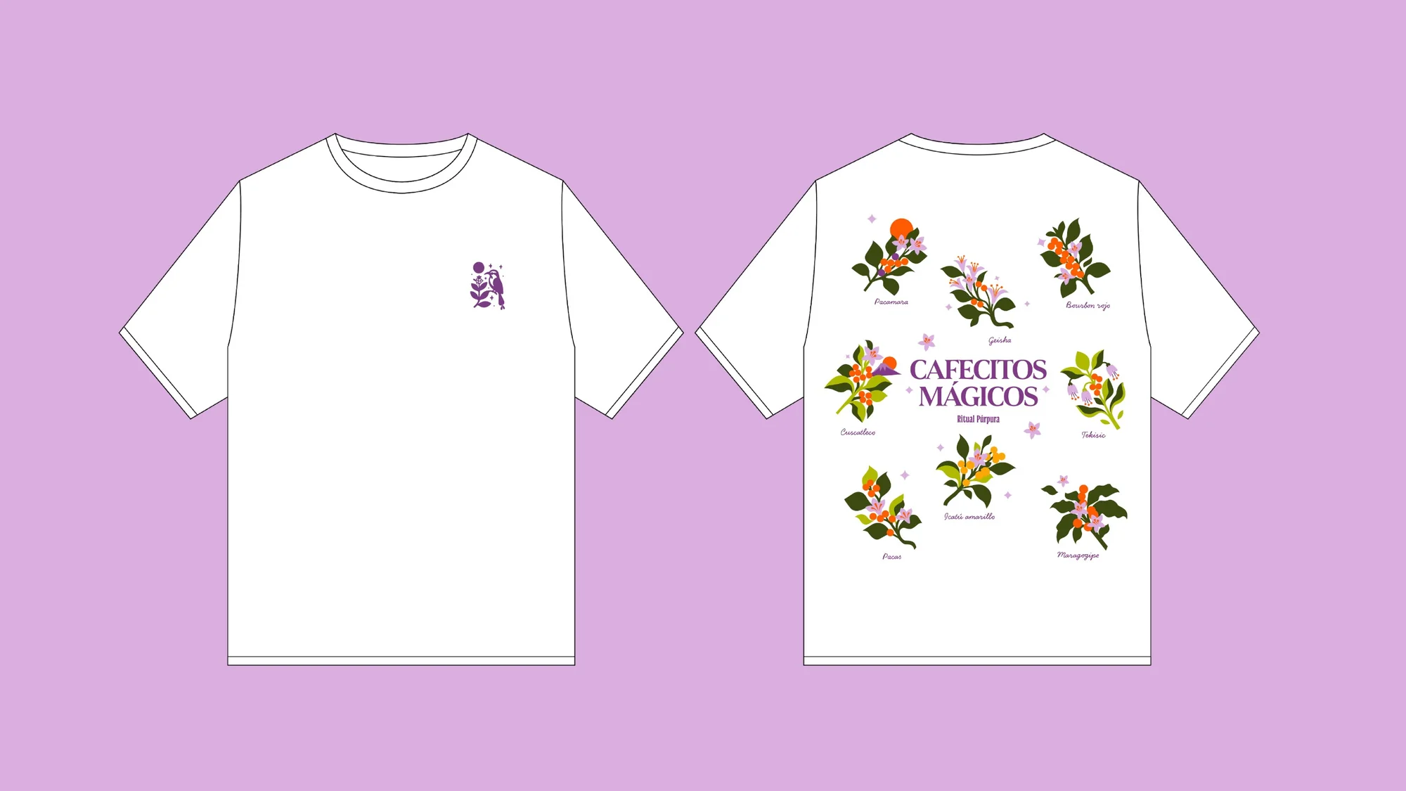
Canvas totes in cream and purple, two T-shirts, a mug, a cap, a scarf, stickers and a keychain. They all come from the same system of color and illustration, so they read as one brand even when they are apart.
The lines
What do the Ritual Púrpura pieces say?
None of them relies on the logo alone. Each one carries its own line: «Cada café guarda su propio ritual» on one T-shirt, «Cafecitos mágicos» on the other and «Cafecito para vibrar alto» on the cap.
The mug saves its line for last. «El ritual de creer en ti», the ritual of believing in yourself, sits at the bottom and reads when the coffee is finished.