Brand identity exploration for GoExto, a real estate company in Miami
GoExto
Branding / Web design
Identity exploration for GoExto, a Miami real estate company: three complete routes — moodboard, logo, color system, and homepage — built in parallel so the decision could be made by looking, not by describing.
- Scope of work
- Branding / Web design
- Client
- GoExto
- Year
- 2024
How do you choose a brand identity for a real estate company?
GoExto is a real estate company in Miami whose stated mission is to educate and empower the investor — not to list properties, but to teach people how to buy them. That one sentence pulls the brand in two directions at once: it has to feel approachable enough to teach someone just starting out, and solid enough for people to trust it with their money.
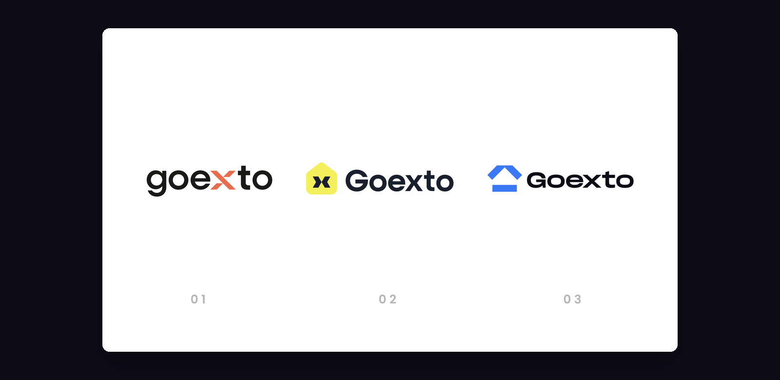
So we did not present one logo. We presented three complete routes, each carried from the moodboard all the way to the site homepage, and we put them side by side.
What the previous brand was already telling us
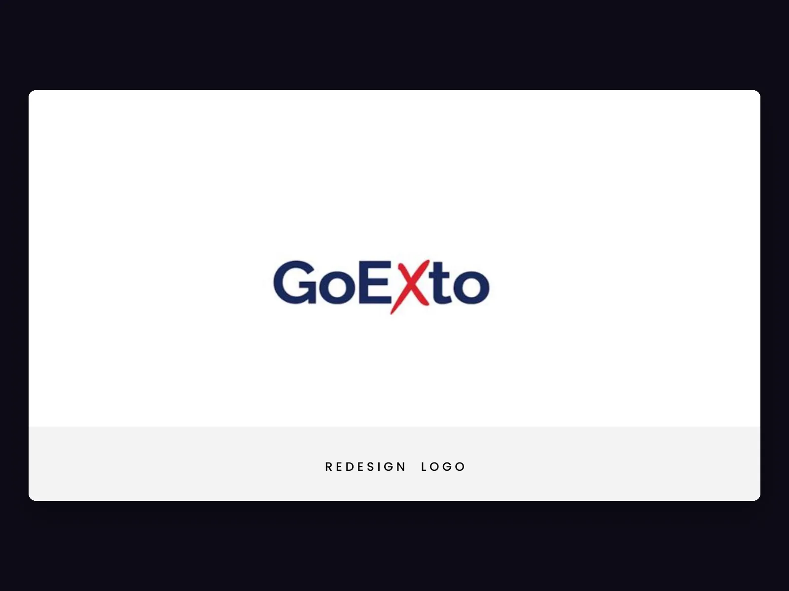
The inherited brand set GoExto in a hard navy blue with the X highlighted in red: one letter doing the work of a symbol, with no system behind it. It gave us the one thing worth keeping: that X is where the name becomes a brand. Every route we drew keeps it, and each one answers a different question about what it should mean.
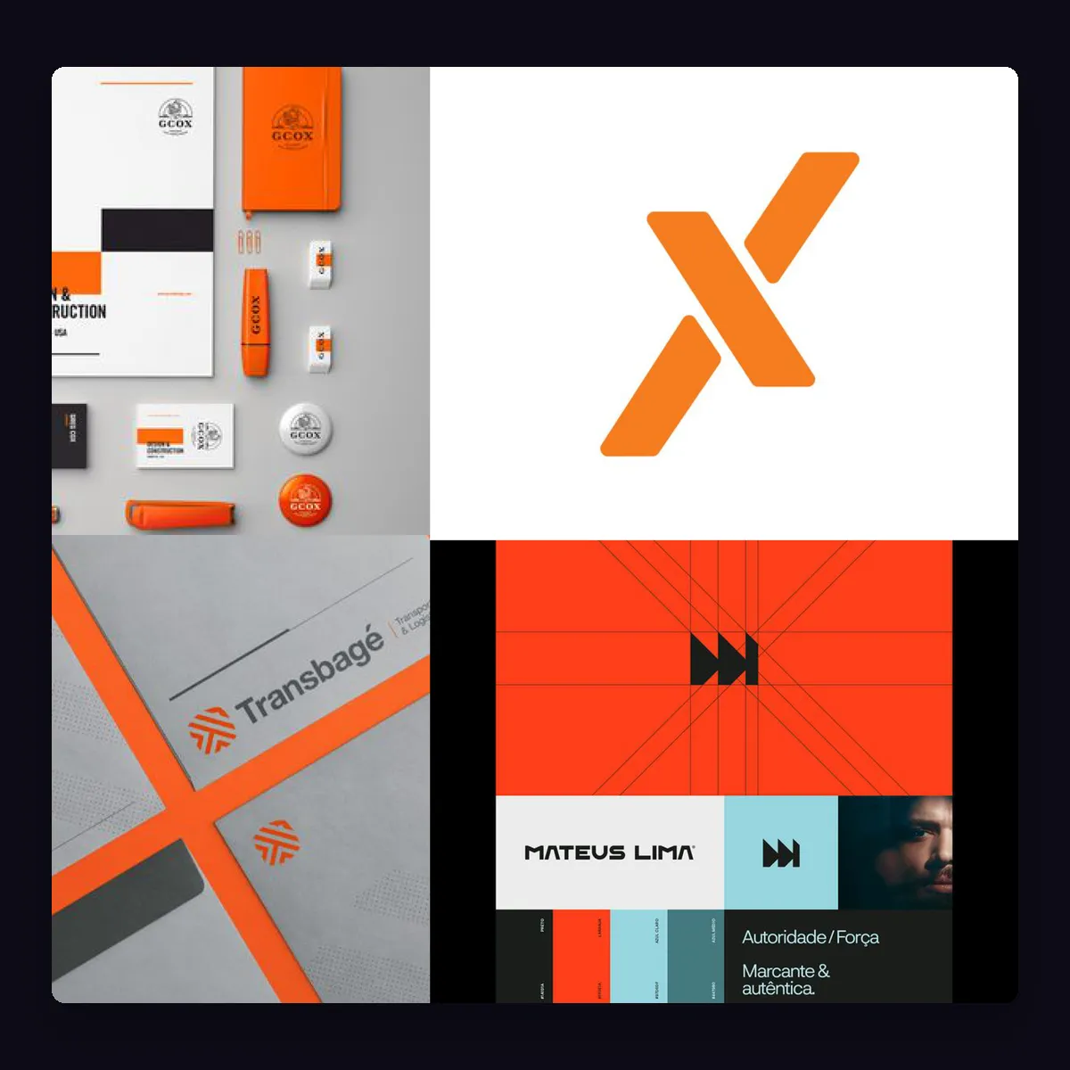
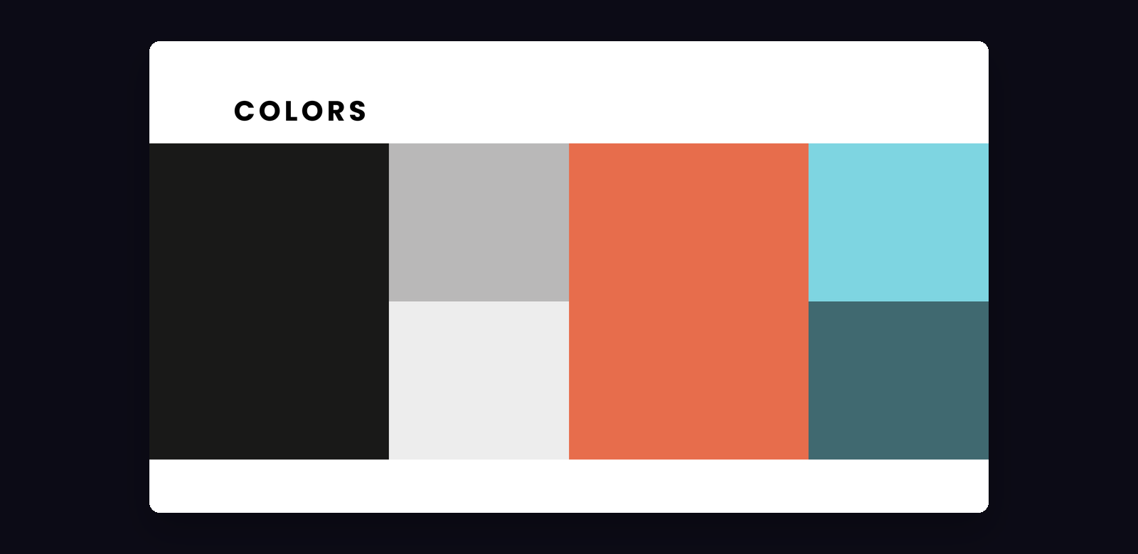
Each route was built in the same four steps, so none of them could win on presentation alone: a moodboard that sets the register, a logo, a color system drawn from that moodboard, and a homepage where all of it has to survive real content — a hero, a search bar, properties, and a call to action.
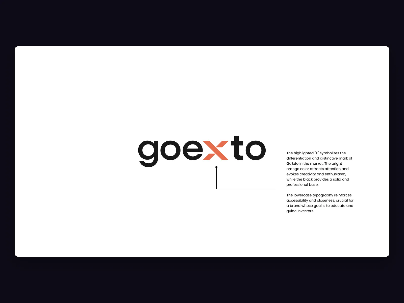
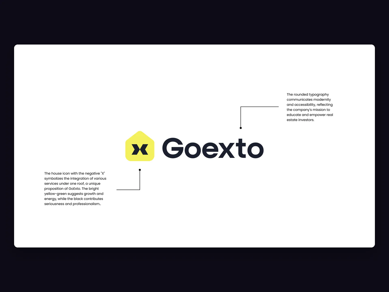
Route 01 makes the X the differentiator. Lowercase, tight, with the letter in vivid orange on black: a brand that grabs attention and reads as creative and enthusiastic, with the lowercase reinforcing the approachability of a brand whose job is to guide. Route 02 turns the X into architecture: a yellow house-shaped plate with the X cut out of it, so the various services sit under one roof, with rounded type for modernity and black underneath for seriousness.
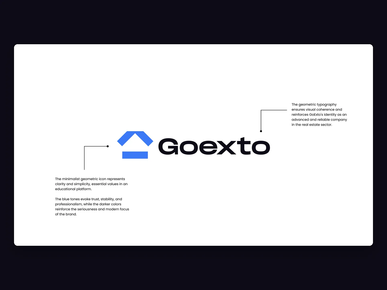
Route 03 argues the opposite. A minimal geometric roof, geometric type, and a blue that reads as trust, stability, and professionalism: the route that treats GoExto as an advanced, reliable operator before a friendly teacher. With the three homepages side by side, the choice stops being a matter of taste: one sells enthusiasm, another sells breadth, another sells reliability, and only the client knows which of the three it needs to sell first.
What we did
Why present three logo routes before deciding?
Three routes, one page, and a decision that finally belongs to the client.